 |
| DFC02.28.13 |

Thursday, May 30, 2013
Another DFC Finished
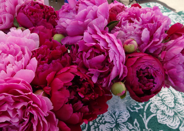
Just thought I would share one more daily fabric composition that I finished. I cannot believe I did these in February and am still working on finishing some.
Wednesday, May 29, 2013
More Monotypes
I've never really understood the different between a monotype and a monoprint until now. Here is how wikipedia explains the different between the two.
"Historically, the terms Monotype and Monoprint were often used interchangeably. More recently, however, these are now used to refer to very similar types of printmaking which are somewhat different. Both involve the transfer of ink from a plate to the paper, canvas, or other surface that will ultimately hold the work of art. In the case of monotypes, the plate is a featureless plate. It contains no features that will impart any definition to successive prints. . . . In the absence of any permanent features on the surface of the plate, all articulation of imagery is dependent on one unique inking, resulting in one unique print.
Monoprints, on the other hand, now refers to the results of plates that have permanent features on them. Monoprints can be thought of as variations on a theme, with the theme resulting from some permanent features being found on the plate—lines, textures—that persist from print to print. Variations are confined to those resulting from how the plate is inked prior to each print. The variations are endless, but certain permanent features on the plate will tend to persist from one print to the next."
Rose Davies (the instructor of our monotype workshop) explained it more simply as a monotype starts with a empty surface (plate), whereas the monoprint starts with an existing printing plate (i.e. a carved woodblock).
I have been back to Wingtip Press to work on a few more three color reduction monotypes like we did in the workshop. I was working with an image of italian prune plums. Here is the resulting print and the ghost print.


I liked the ghost better and will see if I can work into it with some oil pastel or pencils. The first print is just a little too strong graphically for what I was envisioning and the texture is also a little harsh.
It was bothering me so much that I had to go back another day to try again. I thought I knew what to do to make it better (for me). Here is the second attempt and the ghost print.


I am much happier with the second attempt. It has a softer look to it. Although now that I have "fixed" it, the first one is starting to grow on me. They are just two different looks of the same image.
Which one do you like better?
Sunday, May 26, 2013


Friday, May 24, 2013
Print 150
I've been writing quite a bit about Wingtip Press and Boise's sesquicentennial lately. And today that trend continues with both. To celebrate Boise's 150 years, Wingtip Press has been doing a series of free workshops (funded by a grant from the City Arts & History department) throughout the year called Print 150.
Participants need to sign up to reserve a space for the two day workshop. In the workshop they create collagraph prints of different houses/buildings found around Boise. Everything is provided and no skill in printmaking is needed. Anyone can do it and it is a great introduction to printmaking.
I signed up myself and Anna to attend the workshop which started last Thursday and was completed yesterday. Last week we worked on creating our plate.

Here is what our plates looked like after we had glued various items onto it (mostly wallpaper papers). Anna's is first.


Amy Nack (Wingtip Press owner and artist) coated the plates and pressed them flat so that this week they would be ready to print. Yesterday we inked up the plates and ran them through the press. We made three prints (2 regular and 1 ghost). A ghost print is made by running the plate through the press after a first run print without re-inking. Here's how they turned out.
I have not made a collagraph print before. It's fun to see how the different textures turn out. One print will be kept for the city and they have been and will continue to be shown in different locations throughout the year.
Wingtip Press will be hosting a few more of these workshops throughout the remainder of the year. Keep checking the website for dates/times or the City Arts & History Department's Boise 150 site.
Participants need to sign up to reserve a space for the two day workshop. In the workshop they create collagraph prints of different houses/buildings found around Boise. Everything is provided and no skill in printmaking is needed. Anyone can do it and it is a great introduction to printmaking.
I signed up myself and Anna to attend the workshop which started last Thursday and was completed yesterday. Last week we worked on creating our plate.
 |
| Anna working on her plate |

Here is what our plates looked like after we had glued various items onto it (mostly wallpaper papers). Anna's is first.


 |
| One of Anna's first run prints. |
 |
| Anna's ghost print. |
 |
| One of my first run prints. |
 |
| My ghost print. |
Wingtip Press will be hosting a few more of these workshops throughout the remainder of the year. Keep checking the website for dates/times or the City Arts & History Department's Boise 150 site.
Wednesday, May 22, 2013
Local Color: Boise 150
Last Friday was the opening reception for the Treasure Valley Artists' Alliance first juried exhibition entitled, Local Color: Boise 150. The exhibition was juried by Jacqueline Crist and celebrates Boise's sesquicentennial.
There was a good turnout for the reception. The exhibition is in the offices of the Boise State Public Radio in the Yanke building on Park Center. Here is a picture of the Yanke building in case you have not been there yet.

As you first walk in, you are greeted with bright colors in the artwork of Brian Schreiner (on the right) and Christine Raymond. You really need to see the texture of Schreiner's piece in person, as well as the gold leaf shine of Raymond's artwork.

All of the artwork was suppose to relate to Boise in some way. Here you might recognize the Capitol in Pat Kilby's painting (middle).

Starting from the left below are artworks by Cyndy Lounsbury, Cassandra Schiffler, David Schwartz and Lauren Kistner.

Mike Chambers paid homage to Boise Blue, an art supply store that shut it's doors years ago.

From left to right artwork by Amy Nack, Betty Hayzlett, Felicia Weston and Ellen Crosby.

Several artists chose the same places to depict in their artwork. I believe there were three pieces of the Capitol Boulevard Memorial bridge built in the 1930's in Art Deco style.
An exhibition catalog has been published with all the artworks and the artists' statements explaining the artwork's relationship to Boise. They are available for purchase on the Treasure Valley Artists' Alliance website. And you can go here to get a preview. It is a very nice catalog.
Monday, May 20, 2013
Heterotropias
I can't believe it has been five days since I last posted. As summer approaches, things seem to get a little busier. I have managed to get a few vegetables planted in the garden boxes and some flowers in the front planter.
Last time, I wrote about the BFA exhibition at Boise State University. While we were there, we also viewed Heterotropias: Institutional Structures and Subjectives by Don Winiecki which is up in the Student Union Building gallery through June 4. According to the artist's statement, Heterotropic space is defined as those which can be categorized as outside, between or overlapping other spaces and places.
Here is the description of the exhibition:
"Based on observations as a sociologist, Boise State University Instructional and Performance Technology Professor Don Winiecki visually investigates the effects and affects of institutional structures on the production of subjectivity. Through the use of conventional realism and academic formality as well as evocative non-representational forms, Winiecki's paint and drawing installation invites viewers to interact with and encounter multiple ways of seeing, perceiving, and potentially responding to those structures."
As we entered the space, we saw two sided artworks hanging from the ceiling with the labels casually placed on the floor. At first I was uncomfortable with the arrangement and having to carefully walk through the space without touching/bumping into any of the artwork as we have been conditioned to do.
But the more time I spent within the arrangement, being part of it so to speak, I thought it made the artwork less pretentious than looking at it on a wall. Since they were two sided, you had to be physically engaged by walking around to the other side. One piece was gently turning from some unfelt air current as I had to chase it around to see the other side. Hanging from one point must have been intentional as hanging from two points would have prevented the turning.

National Identity Card shows a person presenting what could be a credit card to another person. What looks like a driver's license is also visible in the wallet. There are all kinds of implications and associations between this visual and the title of the piece.

I especially like the shapes in this one and the perspective from above. It is entitled Inside the Grid (Pedestrian Mall). I think there are several pieces where humans are being observed from above. Is it a study of the patterns of human behavior or just an interesting point of view?
The grid on top seems to beg an analysis of the forms. How far apart are they? How are they grouped together? I think this piece would read very differently without the grid. The grid gives it structure and implies something.
This is a very interesting exhibit and probably probes deeper thoughts than my brain can handle. It is worth a look.
Last time, I wrote about the BFA exhibition at Boise State University. While we were there, we also viewed Heterotropias: Institutional Structures and Subjectives by Don Winiecki which is up in the Student Union Building gallery through June 4. According to the artist's statement, Heterotropic space is defined as those which can be categorized as outside, between or overlapping other spaces and places.
Here is the description of the exhibition:
"Based on observations as a sociologist, Boise State University Instructional and Performance Technology Professor Don Winiecki visually investigates the effects and affects of institutional structures on the production of subjectivity. Through the use of conventional realism and academic formality as well as evocative non-representational forms, Winiecki's paint and drawing installation invites viewers to interact with and encounter multiple ways of seeing, perceiving, and potentially responding to those structures."
As we entered the space, we saw two sided artworks hanging from the ceiling with the labels casually placed on the floor. At first I was uncomfortable with the arrangement and having to carefully walk through the space without touching/bumping into any of the artwork as we have been conditioned to do.
But the more time I spent within the arrangement, being part of it so to speak, I thought it made the artwork less pretentious than looking at it on a wall. Since they were two sided, you had to be physically engaged by walking around to the other side. One piece was gently turning from some unfelt air current as I had to chase it around to see the other side. Hanging from one point must have been intentional as hanging from two points would have prevented the turning.

 |
| Watchful Eye by Don Winiecki |
 |
| National Identity Card by Don Winiecki |

I especially like the shapes in this one and the perspective from above. It is entitled Inside the Grid (Pedestrian Mall). I think there are several pieces where humans are being observed from above. Is it a study of the patterns of human behavior or just an interesting point of view?
The grid on top seems to beg an analysis of the forms. How far apart are they? How are they grouped together? I think this piece would read very differently without the grid. The grid gives it structure and implies something.
This is a very interesting exhibit and probably probes deeper thoughts than my brain can handle. It is worth a look.
Wednesday, May 15, 2013
Varia: BFA Exhibition - Part 2
The other part of the Boise State University Varia: BFA Exhibition was held in the Hemingway Center on campus. This venue seems a little more intimate as it is a little darker and free standing walls create different, smaller spaces.
The first two photos show some cyanotype pieces created by Heather Wade. The first is made on a large piece of cloth. The other is on a small piece on paper. Heather happened to be there taking pictures and Mary and I discussed her work with her.
Mary works with cyanotype and other alt-processes so Heather was happy to meet someone working in the same medium.


I was attracted to the simplicity, repetition and subject matter of this artwork by Tanith Brown. The smaller frame has burnt matches attached to the paper. In the larger frame, the artist has drawn the matches with pencil.

Here is a close up view of the drawing.

I approached this ceramic piece by Elyse Hestead-Murphy from the backside and didn't realize there was a figure until I walked around to the front. It is made of separate pieces that appeared to be stacked and adhered together.

It seemed like the majority of the artwork in the Liberal Arts building was created by guys, whereas the majority (if not all) of artwork in the Hemingway Center was created by girls. I don't think this separation was made on purpose, but it's an interesting observation.
Overall, I found the exhibition very interesting.
Tuesday, May 14, 2013
Varia: BFA Exhibition - Part 1
One of the people in our monotype workshop was a BSU student, Karl LeClair. He told us he had some of his artwork in the Boise State University's BFA Exhibition entitled Varia. Mary Donato and I said we would go see it. The last day of the exhibit was last Thursday and that is when we went.
BSU has several gallery spaces spread around campus. Varia was in two different areas, the gallery in the Liberal Arts building and in the Hemingway Center. We started in the Liberal Arts gallery.

Below is Karl's piece. We recognized it right away because 1) it is facing the entry to the gallery and 2) he used a similar motif for his prints in the workshop. These are all prints and the plates he used to print them are on the floor.

Here is a close up view of some of the prints which were held together by magnets.
 Each artist had a statement about their work which was in a binder by the entrance to the gallery. It was very interesting to read the statements.
For example, this blurry picture is of photographs by Stephanie North, entitle As One. She is exploring the perception of college athletes. Each photo has a student athlete dressed in their sport's attire and also a photo of them dressed in their street clothes, illustrating the fact that their sport or people's perception of a student athlete is not the only thing that defines the person.

These next two pieces are by Adam Atkinson. I was surprised to see work using fabric and stitches although I do believe textile/fabric/fiber art is becoming more widely accepted as a fine art (as opposed to fine craft) in the general art world.
I was particularly interested in these because it was a male artist that created them. The majority of artists working in textile/fabric/fiber tend to be female. And Atkinson talks about the tradition of hand crafts done by women in his statement and is exploring gender roles in these pieces.
This first piece, Alternate Identity, is reminiscent of Nick Cave's full sized bears covered with found sweaters in the Boise Art Museum's recent exhibition, Meet Me at the Center of the Earth. Perhaps Atkinson was influenced by that.

In this artwork, Looking, Atkinson created lines using hand stitches on canvas.


Most of the artwork in this gallery seems to explore perceptions of identity, our roles in society and relationships, all natural subjects for young adults.
In the next post, part 2 of Varia.
BSU has several gallery spaces spread around campus. Varia was in two different areas, the gallery in the Liberal Arts building and in the Hemingway Center. We started in the Liberal Arts gallery.

 |
| Overview of the Liberal Arts building gallery. |

Here is a close up view of some of the prints which were held together by magnets.

For example, this blurry picture is of photographs by Stephanie North, entitle As One. She is exploring the perception of college athletes. Each photo has a student athlete dressed in their sport's attire and also a photo of them dressed in their street clothes, illustrating the fact that their sport or people's perception of a student athlete is not the only thing that defines the person.

These next two pieces are by Adam Atkinson. I was surprised to see work using fabric and stitches although I do believe textile/fabric/fiber art is becoming more widely accepted as a fine art (as opposed to fine craft) in the general art world.
I was particularly interested in these because it was a male artist that created them. The majority of artists working in textile/fabric/fiber tend to be female. And Atkinson talks about the tradition of hand crafts done by women in his statement and is exploring gender roles in these pieces.
This first piece, Alternate Identity, is reminiscent of Nick Cave's full sized bears covered with found sweaters in the Boise Art Museum's recent exhibition, Meet Me at the Center of the Earth. Perhaps Atkinson was influenced by that.

In this artwork, Looking, Atkinson created lines using hand stitches on canvas.

Toward the middle of the gallery, there was some smaller sculptural work by Everett Hoffman. This one is entitled Our Love of Spoons. These are very well done with the carving and execution. Hoffman has taken an everyday object we can all relate to and has put it on a pedestal, literally.

In the next post, part 2 of Varia.
Sunday, May 12, 2013
Drawing at Surel's Place
Did I mention that I am an art-workshopolic? On Saturday, I attended a drawing workshop at Surel's Place in Garden City. It was free, so how could I resist?
For those who do not know, Surel Mitchell was a local artist. Unfortunately, I did not know her personally, but knew of her. After she passed away, her house was donated to the city and is now used for an artist-in-residence.

I like how the artwork and books owned by Surel are still there. Here is a small, blurry picture of the tiny bathroom that has artwork covering almost every inch of the walls. These were by different artists.

The current artist-in-residence is Jennifer Wu and she was the workshop instructor. What we did was look at artworks by some of the masters and drew them. I liked what Jennifer said at the beginning, that it doesn't matter if we end up with something looking like the painting, the point is to see what the artist did. And we did not share our drawings, although you could see what others were doing.
Also, we were asked to point out things we noticed about the painting as we were sketching. It really is a good exercise as you are looking at a piece for an extended period of time and noticing things you wouldn't if you only spent five minutes looking. It also makes you appreciate the artwork more.
We spent about a half an hour on each drawing looking at a projected image on a screen. All the artworks were paintings, so translating it into a drawing was a little different. We were asked to bring our own drawing supplies. So, I brought my sketchbook, some larger paper and an assortment of pens and pencils.
While she was in town, our printmaking instructor, Rose Davies (from Wales), gave a little talk about her daily sketching habit. She uses pens for her sketching and at one point said that pencils were for wussies (jokingly, I think). But at another time when she was talking about teaching rehab patients to draw, she said she never gives them pencils because it is too advanced for them. So, I'm not sure where she really stands on the issue, except that she uses a pen.
I admit I am a wuss and like to use pencil in case I would like to erase. I understand that the point of the pen is to commit to the line and not worry about mistakes, I guess.
Anyway, I used my mechanical pencil and drew in my regular sketchbook. I did not have my eraser out and, hence, did not use one.
Here is my first drawing. We were looking at Picasso's A Muse. I scanned all these drawings in black and white so the contrast is not really as much as it seems here.

Since I started the drawing on the left hand side of the paper, I ran out of room when I got to the second figure on the right. You can see a couple of mistakes where I was not able to erase.
For the second drawing, we looked at a still life by Cezanne. This artwork had a lot of dark values and was very painterly, which made it hard to translate into a drawing.

The third artwork was Bonnard's Dining Room in the Country.


Here is what it really looks like.

And here is some of Jennifer's work. (You might recognize the bathroom in the lower left corner.)

Some insights I had doing the exercise:
- I approached my drawing differently with the different styles of painting.
- I started getting better at the proportions as we went along (more practice).
- I didn't need an eraser as much as I thought (there were only a few places I would have liked to erase).
- I should do this exercise more often.
For those who do not know, Surel Mitchell was a local artist. Unfortunately, I did not know her personally, but knew of her. After she passed away, her house was donated to the city and is now used for an artist-in-residence.

I like how the artwork and books owned by Surel are still there. Here is a small, blurry picture of the tiny bathroom that has artwork covering almost every inch of the walls. These were by different artists.

The current artist-in-residence is Jennifer Wu and she was the workshop instructor. What we did was look at artworks by some of the masters and drew them. I liked what Jennifer said at the beginning, that it doesn't matter if we end up with something looking like the painting, the point is to see what the artist did. And we did not share our drawings, although you could see what others were doing.
Also, we were asked to point out things we noticed about the painting as we were sketching. It really is a good exercise as you are looking at a piece for an extended period of time and noticing things you wouldn't if you only spent five minutes looking. It also makes you appreciate the artwork more.
We spent about a half an hour on each drawing looking at a projected image on a screen. All the artworks were paintings, so translating it into a drawing was a little different. We were asked to bring our own drawing supplies. So, I brought my sketchbook, some larger paper and an assortment of pens and pencils.
While she was in town, our printmaking instructor, Rose Davies (from Wales), gave a little talk about her daily sketching habit. She uses pens for her sketching and at one point said that pencils were for wussies (jokingly, I think). But at another time when she was talking about teaching rehab patients to draw, she said she never gives them pencils because it is too advanced for them. So, I'm not sure where she really stands on the issue, except that she uses a pen.
I admit I am a wuss and like to use pencil in case I would like to erase. I understand that the point of the pen is to commit to the line and not worry about mistakes, I guess.
Anyway, I used my mechanical pencil and drew in my regular sketchbook. I did not have my eraser out and, hence, did not use one.
Here is my first drawing. We were looking at Picasso's A Muse. I scanned all these drawings in black and white so the contrast is not really as much as it seems here.

Since I started the drawing on the left hand side of the paper, I ran out of room when I got to the second figure on the right. You can see a couple of mistakes where I was not able to erase.
For the second drawing, we looked at a still life by Cezanne. This artwork had a lot of dark values and was very painterly, which made it hard to translate into a drawing.

The third artwork was Bonnard's Dining Room in the Country.

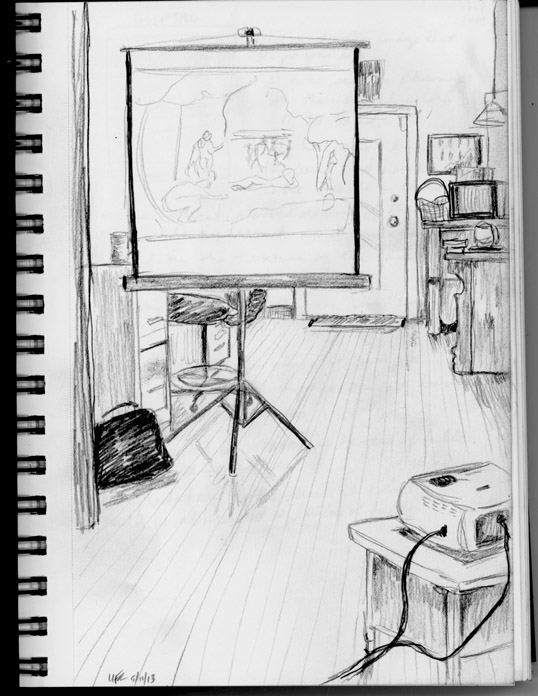
By the last drawing, I was getting tired of drawing the masters. The last piece was a Matisse. So instead of drawing it, I decided to draw what I was seeing in the room.
Here you can see the projector and the screen we were looking at and some of the other things around it.

And here is some of Jennifer's work. (You might recognize the bathroom in the lower left corner.)

Some insights I had doing the exercise:
- I approached my drawing differently with the different styles of painting.
- I started getting better at the proportions as we went along (more practice).
- I didn't need an eraser as much as I thought (there were only a few places I would have liked to erase).
- I should do this exercise more often.
Friday, May 10, 2013
Striae I
Here is a better look at Striae I that is hanging in the WaterCooler building. The Striae pieces are a subset of my Lines series. The light color section has lines that were screen printed as well as free-motion machine stitching lines. The rectangle was created when the screens overlapped, same with the darker lines.


Striae I
hand dyed and screen printed fabrics,
machine pieced, free-motion machine stitching
16-1/2" x 18-1/2"
©2013 Lisa Flowers Ross
$250
Thursday, May 9, 2013
Art at the Watercooler
Several weeks ago I talked about the Chair Affair lecture event my friend and I went to. The event was held at a building called the WaterCooler. Here is a description of it:
"Located at the corner of 14th and Idaho, the WaterCooler is downtown Boise's home to emerging and innovative businesses - the future of job growth and economic potential in our community. We provide our residents with a home that encourages collaboration and offers mentoring, community engagement, growth, and success. We offer a venue for dialogue, learning, creativity, and the entrepreneurial spirit. A community-based non-profit, we welcome involvement and support."


"Located at the corner of 14th and Idaho, the WaterCooler is downtown Boise's home to emerging and innovative businesses - the future of job growth and economic potential in our community. We provide our residents with a home that encourages collaboration and offers mentoring, community engagement, growth, and success. We offer a venue for dialogue, learning, creativity, and the entrepreneurial spirit. A community-based non-profit, we welcome involvement and support."


Those are a bunch of water containers on the wall behind the desk.
While at the event, we noticed some local artists were showing artwork on some of the walls. Later, I contacted the building manager and ask if they would like some more artwork on their walls. The answer was yes.
I went back to look at the walls and measure. The other artists had the main walls in the front, but there were quite a few empty walls in the rest of the space. Eventually, I decided to hang three pieces.

My Personal Logograph #5 hangs in this area that has a foosball table in it. I think it helps brighten up the space. I had originally planned to hang Sun Spots here, but that will be sent off to an exhibition soon.
The only lighting in the hallway areas seems to be natural lighting from the windows. So it is a little dark. These are the other two pieces I hung. The one on the left is Striae I and one the right is Color Fields #15, in it's original orientation. For my Color Fields exhibition, we decided to hang it vertically.

Subscribe to:
Posts (Atom)