Pages

Showing posts with label art. Show all posts

Saturday, January 10, 2015

A Walk through the Field (Study)

I have finished my first artwork of the new year!  O.k., o.k. it was actually started last year and I didn't get it done before the end of the year.  So now it is the first of 2015.


Field Study
48-1/4" x 37"
©2015 Lisa Flowers Ross
$2700

Since most of my artwork is abstract, I thought for this piece I would walk you through the thought process from start to finish.

The first step comes when I see something that inspires me.  That is easy because I see things around me all the time, especially in nature, that inspire me.  What I saw for this piece were the bare branches of dogwood bushes as I drove back and forth to Ketchum.

Here is a picture I took somewhere along the road.  It's hard when you see something while driving. (Yes, I stopped and pulled over to take the picture.  Even got out to walk along the highway to get the view I wanted. The things we do for art!)


What inspired me were the colors of the bushes that stood out so brightly in the winter landscape.

The next step was to go to my sketch book and draw out some designs.  I did several thumbnails and this was the one I went with for the piece.  The numbers and dotted lines were added later while I was working on the piece.


After I had my sketch, I went to my fabric stash to pick colors. I really wanted a deep red burgundy color, but I just didn't have that color in my dyed fabrics.  These lean more toward purple.  That is one of the hard things about dyeing fabric only once a year.  You have to make do with what you have.  It's also a good challenge.

I pulled out a bunch of fabrics I thought would work to represent the branch colors.  I also pulled out some golds/tans to represent the grasses.  Do they match the photo colors?  No, they don't have to.  That was just the inspirational start.

When I had chosen the colors, then I went back to the sketch to figure out how I was going to piece it together.  It looks simple but the order is a little different than what you might think.  That's what all the numbers on the sketch are for, the order to put sections together.  The dotted lines are the seam lines for the sections.

From that point, I just cut the pieces within each section free-hand and sewed them together. Then, sewed the sections in order of the numbers.

Once everything was sewn together, then I had to make a decision about how to do the quilted stitches.  I had several ideas.  Here is one of them where I have more of a free-motion scribble stitch in the top section.  This would represent the scrubby sage brush in the background and would also be denser stitching to help "push" that section back to create a small amount of depth.


Although I liked that concept, there is more energy in those scribbles and I wanted to stay with the more gentle, flowing vertical lines of the seams.  And that is what I did, I stitched gently curving, vertical lines.

The thread color was another choice that needed to be made.  I wanted to use a variegated thread to create a little variation.  I used the same thread in the orange section as I did on the bottom section.  It looks completely different on different backgrounds.  I used a similar but slightly brighter color of thread in the gold section, although it actually looks darker than the other.  That is some of the fun of playing with threads, or anything.  Colors will change depending on what colors they are next to.

Even though you might not be able to tell from the picture of the finished piece, I trimmed the edges free-hand with slight curves (maybe a little too slight).  All that is left to do is sew on the sleeve and put on a label (and cut a hanging rod), which brings me to the last step - the title.

In my mind as I was working on this, I was just referring to this piece as Field Study.  But when I found out the type of bush was a dogwood, I did some research online about the scientific name or any other information that would suggest a different title (like the word "dagger" came up in my searches, I think it was the meaning of a latin name for the bush).

I didn't really like any of the things that I found with my search.  For now, I think it is going to be Field Study (K1).  "Field study" because the bushes were out in the field.  And "K1" for Ketchum and the first in what I hope will be a series.  I can continue with the dogwood bush inspiration or I also envision using some of the many other pictures I have of fields for inspiration, in which case the letters would change to something like "B1".   That could be the first of a Boise field inspiration.

Now you know how this artwork came into being.

Wednesday, September 25, 2013

Busy

It's busy, busy, busy here for me right now.  My studio is a mess, a productive mess, but a mess still the same.  I am working on pieces in several different series.  That is unusual for me since I don't consider myself a very good multi-tasker.  I tend to want to stick to one thing until it's done.

I realize that I haven't shown you the second piece in the Striae series, which has been finished for quite a while.  This series is on hold.  While I have other ideas for it, it has been set aside for now.

Striae II
hand dyed and screen printed fabrics,
machine pieced, machine stitching
43-1/4" x 41"
©2013 Lisa Flowers Ross
$1900

It's kind of hard to tell from the photo, but the center rectangular section has fabric that is screen printed with white lines.  I think part of the reason this series got set aside is that I want to explore more ways to screen print/paint/stamp/etc. lines on fabric.  And I haven't gotten to it yet.

Friday, August 16, 2013

Branching Out

My main medium to work in right now is fabric.  But as an artist, I don't think we should be limited by or to our medium.  Alexander Calder may be best known for his sculptures and mobiles.  But did you know he also did paintings, drawings, prints, jewelry and set design?

Over the years I have tried different media and, more recently, I am really enjoying all the printmaking workshops I have been taking at Wingtip press.  Wingtip press is located in the Creative Access Art Center building downtown that also houses Idaho Parents Unlimited.

CAAC will be holding a special fundraising art event in October.  They are asking artists to submit artwork on a 12" x 12" wooden panel (provided by them) for an auction.  I was trying to decide if I wanted to participate or not.  But I just couldn't resist the smooth wooden panel just waiting to be made into art.

After getting the board, I thought the easiest thing to do would be to attach one of my 12" x 12" fabric pieces that I already had made.  But that would cover up the panel.  Then, I thought I would do a painting on it (haven't done painting in a long time but it has been on my mind lately).

But instead I "branched" out and did something different instead.

A Nod to AG
birch bark and branches on wood panel
12" x 12"
©2013 Lisa Flowers Ross
Will be available at the CAAC Art for Art: A Night on the Boardwalk event

Since a nasty virus has been slowing me down the last week and a half, I have been taking some time during the day to rest.  One of those days, I was looking at one of my art books on Andy Goldsworthy, an artist who works with nature.

Later, I went outside and picked up some of the pieces of bark that our birch trees shed, along with some branches.  Back inside I started playing and this is what I came up with - a very minimal piece.  It is all coated and sealed with matte medium.

I like the colors and the lines in the bark.  There is one little line on the wood panel in the lower left corner that echoes the lines in the bark.  I didn't see it until after I was done.

I think I need to make another one because this would look great in my kitchen.

Monday, August 12, 2013

Bobbin Work

Here is another new artwork I managed to finish recently.  It started out as part of a larger piece which was part of a new series I have started.  But when I had it all pieced together, I decided I didn't like it.  So I cut it up, ripped seams, added some new parts, re-sewed and now I have this piece, which no longer fits in the series.  And I have another part that still needs some work.

Lined Up Around the Block
38-1/4" x 22-1/4"
fabrics hand dyed and rusted by artist, 
machine pieced, machine stitched
©2013 Lisa Flowers Ross
$1100

You might notice the darker horizontal lines of stitching.  This was done with a heavier, perle cotton thread.  The problem with using perle cotton thread is that it is too thick to go through the machine needle.  So to use it in the machine, it needs to be in the bobbin.  I have a separate bobbin case for this because you really need to loosen the tension on it a lot.

Using the perle cotton in the bobbin means it will be on the bottom of whatever I am sewing. Therefore, if I want it on the front, then I have to sew the piece back side up.  But then I can't see where I want to go.

What I did was pin where I wanted the lines to go from the front and then flipped it over.  On the back I could see the pins and then I placed 1/4" masking tape along the pin lines, removed the pins and I was ready to sew.

Here is a picture of what that looked like when I was sewing.


I learned this bobbin work technique in a class I took many years ago.  I have not used it in my work before.  But I'm glad I had the knowledge to do it now because I like the look of those thicker lines.

Friday, August 9, 2013

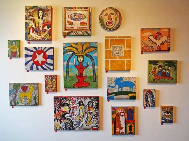
After a yummy lunch at a'Tavola the other day, my friend and I went to the Linen Gallery to look at Karen Bubb's exhibition, Cuba on the Cusp.  All the works are encaustic, a painting technique using melted wax with pigment.

Bubb is a local artist, as well as the Public Arts Manager for Boise City Department of Arts and History and an adjunct professor at BSU.  With all she has on her plate, I wonder how she had time to create so many artworks for the exhibition.

Some pieces were hung in the traditional gallery/museum style.


While others were hung in a salon style.

There were even some artworks on a table, along with glass pendants that Bubb had made with some of the Cuban images.

The medium and subject matter tied the work together but there was a wide variety of styles from portraits and landscapes to more abstract and folk-art like work.  Bubb really captured the essence of what Cuba must be like, at least from a visitor's viewpoint.

If you haven't seen the exhibition yet, it is up through August 30th at the Linen Gallery (1402 W. Grove St.) downtown.

Friday, August 2, 2013

New Artwork, New Gallery

Between all the summer trips and other activities, I have been trying to get some work done.  I have several pieces put together.  I just have to do the stitching on them.   But I can show you this piece that I have finished.

It is the first, in what I hope will be a series (although there is only this one just now).

Foliaris I
33-1/4" x 29-1/4"
fabrics hand dyed by artist,
machine pieced, machine stitched
©2013 Lisa Flowers Ross

Here is a detail of the stitching with orange thread in the middle.


This piece will be available for purchase at the Robin B Gallery in Chicago when it opens in September.  I am happy to have this gallery representation.

Their physical doors may not be open yet, but they do have the website up and running. Click on their name above to check it out.

Tuesday, July 30, 2013

Intaglio Printing

The summer is going by quickly.  I can't believe it has already been a month since Anna and I participated in an Intaglio workshop at Wingtip Press.  We did the drypoint technique on a copper plate. With this technique you "draw" into the plate with a sharp tool.

Our instructor, Cassandra Schiffler, had us practice on CDs first.  Here she printed three of ours together.  (Mine is in the middle.)


Then, we worked on the copper plates.

This is my setup.  

Anna working on her plate.

While we were working, we were listening to the destruction outside of the road being torn up and the beautiful gingko trees being taken down.

When the plates were ready we inked them up, ran them through the press and decided if we needed to go back and work on them some more.

Anna printing.  It's common for people to hover around the press when someone is printing because they want to see how the print turns out.


This is the print Cassandra was working on.

Here's one my friend, Mary, was working on.

Here is Anna's print of a hedgehog in a mug that looks like a tardis (if you watch Dr. Who then you know what that is).

This is one of the prints that I did, which I actually like.

Here is another print I did where I was trying to be more abstract.  This one has a romantic wipe of the ink.  That means you don't clean off as much of the ink before printing.
I enjoyed the workshop and hope I can do more of these in the future.

Thursday, May 9, 2013

Art at the Watercooler

Several weeks ago I talked about the Chair Affair lecture event my friend and I went to.  The event was held at a building called the WaterCooler.  Here is a description of it:

"Located at the corner of 14th and Idaho, the WaterCooler is downtown Boise's home to emerging and innovative businesses - the future of job growth and economic potential in our community. We provide our residents with a home that encourages collaboration and offers mentoring, community engagement, growth, and success. We offer a venue for dialogue, learning, creativity, and the entrepreneurial spirit. A community-based non-profit, we welcome involvement and support."


Those are a bunch of water containers on the wall behind the desk.

While at the event, we noticed some local artists were showing artwork on some of the walls. Later, I contacted the building manager and ask if they would like some more artwork on their walls. The answer was yes.  

I went back to look at the walls and measure.  The other artists had the main walls in the front, but there were quite a few empty walls in the rest of the space.  Eventually, I decided to hang three pieces.


My Personal Logograph #5 hangs in this area that has a foosball table in it.  I think it helps brighten up the space.  I had originally planned to hang Sun Spots here, but that will be sent off to an exhibition soon.

The only lighting in the hallway areas seems to be natural lighting from the windows.  So it is a little dark.  These are the other two pieces I hung.  The one on the left is Striae I and one the right is Color Fields #15, in it's original orientation.  For my Color Fields exhibition, we decided to hang it vertically.


Tuesday, May 7, 2013

Three Color Reduction Monotype - Last Day

Monday was the last day of our Wingtip Press workshop with Rose Davies.  Rose will be giving a talk this Wednesday evening at Wingtip Press, 6:30 p.m., if anyone would like to attend.

The first few days of the workshop, my subject matter was representational images.  Amy asked me why I didn't do something like the more abstract stuff I do with fabric.  I had been thinking about that, noticing that when I am doing some kind of print, I mostly pick more realistic things. Why is that?

My thoughts are that the two mediums are so very different. So, my brain thinks about them differently. With the fabric, I can get a strong graphic line with a seam and have geometric shapes of color.  A linocut has a nice strong graphic line, but with this technique of monotype, you really have to work at getting a strong crisp line.  It lends itself better to more blending and softer lines.

However, Cassandra worked abstractly the first few days and inspired me to try something abstract on this last day.  (She did something representational on the last day.)  Below is one of her abstract prints.


I also did two prints instead of one.  Here is the yellow layer of one of them (it's upside down) and the other one was just all yellow.


Here is the first one with the red layer on top.  We used a little bit different ink this time and I think we were able to get more color on the first print.


Here is my second print with the red layer completed.

Then, we had a little tea break.  
Rose had made some Welsh cakes in the morning and brought them for us to try.  Very delicious.   

Afterward, it was back to work finishing up the blue layer.  Here is my second print completed.


Here is Cassandra's finished representational print.

I forgot to get a picture of my completed first print, but you can see it (along with the ghost prints) on the near end of the table in this picture where we have laid out most of the prints from the workshop.


When we had these laid out on the table, I noticed that my prints from the first two days had a similar palette of mostly greens and blues.  Whereas, the last day when I went abstract with the prints, the palette is mostly yellow and red (and very bright).  I think I would like to mess around with the stripes some more and the other abstract idea as well.

I'm really glad we had several days to work with this process.  As with most things, it helps to practice and it helped cement the concept into the brain.  I hope to do some more of this.

Sunday, May 5, 2013

Reduction Monotype Day 2

Saturday, we spent another day at Wingtip Press working on a second reduction monotype.  This time I chose a simpler subject, canning jars, but it was harder to work with.  I learned some things from the day before and hoped it would make today's print better.

Tyler and Rose working, with the press we used in the foreground.

Once again, we started with yellow.

Then comes process red.  This is my plate lying on top of the paper that was already printed with yellow.  It's ready to run through the press.

Here is Gale's print with the red printed.

Blue is last and you never know how it's going to turn out.  This is my final print.

After running the first print and the ghost prints with the blue, I decided to just run the blue plate through the press on a new sheet of paper.  I really like this ghost.

Here's Gale's final print.

And Carl's final print with the ghost print.

As I was working the different layers on mine, I realized, too late, I had made some mistakes.  I am not going to point them out to you.  But it is just more learning for me.  I am happier with my second print.

And here is some used up scrim that I thought looked pretty just lying on the table.


Saturday, May 4, 2013

Reduction Monotype

Yesterday was the second day of our workshop.  We worked on a three color reduction monotype.  Using a light box, we put our drawings or photos under a piece of plexiglass for reference.

First, you start by covering the plate with a layer of yellow ink (we used a litho process yellow mix with plate oil).  Then you start removing the ink with items like q-tips, scrim, brushes, chopsticks, etc.  Here is Rose demonstrating with her drawing.


Since we only used yellow, process red (magenta) and process blue, you really have to think about the areas where the colors will be mixed.  Not only do you remove all the white areas from the yellow but also any area you want pure blue, pure red, or purple.

When it's completed it looks something like this.


Then you put it on a piece of paper and run it through the press.   Since this is a monotype you will only get one print.  But a ghost image can be run through the press with a second piece of paper.

The plate gets cleaned off and you start the process again with red.  Below is my plate in the process of removing the areas where I don't want red (magenta).  I didn't want a lot of red so I ended up cleaning most of it off.  Where you leave all three colors you will get a black.


The red is printed on top of the same paper with the yellow.  So you have to be careful to register the plate very well for the second and third run through the press.  Here is my red printed over the yellow.


The last step is the blue and you really don't know what the print is going to look like until this very last step of running the blue through the press.

Here is my final print.  I'm not that happy with it as it turned how quite a bit different than what I had envisioned.  But now that I have been through the process I have a better idea of how the layers work together and the different ways to remove the ink.  

Here is the ghost print.  I could use this as a base to go back in and use colored pencils or pastels.


It is also good to see what others used and how they did theirs.  We all had fun watching each other pull their prints and watch how the different steps built up.  It was always a surprise at the end.

Here is Cassandra's finished print, which I love and is totally in her style.


Here is Tyler's finished print.

And here is the instructor's finished print.


I'm glad we get to do another one today and on Monday.  I think I need some more practice.