

Wednesday, October 31, 2012
Tuesday, October 30, 2012
Personal Logograph Series
In my last post, I showed you my first test piece for the Logograph series and explained why I wasn't happy with it.
On my second test piece, I decided to try zigzag stitching the background pieces together hoping to create a flatter edge so that the paint would go over it more evenly.
I also decided to try using commercial fabrics to see what more pattern/variation would be like in the background under the paint. Once again, I fused on the black shapes and stitched them down. I did the free motion stitching and painted over the entire background.
Here is how test piece #2 turned out.


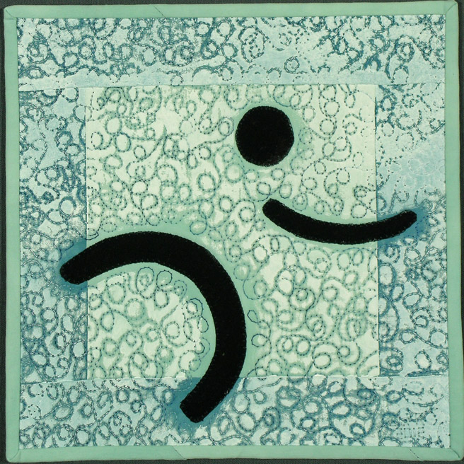
The zigzag seams were a little better, but I still wasn't happy with them. I did better with the contrast of the "halo" effect and making it more noticeable. But I wasn't there yet.
Tomorrow - test piece #3.
On my second test piece, I decided to try zigzag stitching the background pieces together hoping to create a flatter edge so that the paint would go over it more evenly.
I also decided to try using commercial fabrics to see what more pattern/variation would be like in the background under the paint. Once again, I fused on the black shapes and stitched them down. I did the free motion stitching and painted over the entire background.
Here is how test piece #2 turned out.

Personal Logograph #2
commercial fabrics, fused and machine stitched
9-1/8 x 9-1/8"
©2012 Lisa Flowers Ross

The zigzag seams were a little better, but I still wasn't happy with them. I did better with the contrast of the "halo" effect and making it more noticeable. But I wasn't there yet.
Tomorrow - test piece #3.
Monday, October 29, 2012
Personal Logograph Series
Earlier in the year, I had an idea for an artwork. How I envisioned it required a different technique than my usual way of working. I was thinking about using paint on top of the quilting. Deidre Adams does this. (I love the textures she creates this way.) Linda and Laura Kemshall, who wrote the book, The Painted Quilt, also use this technique.
I wanted to make the piece kind of big, but didn't want to get to the end and ruin it with the paint. So, I decided to do some test pieces first.
For the first piece, I just sewed together some scraps of my hand dyed fabrics. I fused on my shapes and machine stitched them down. I did my free motion quilting and then painted over the whole piece with white acrylic paint. I wanted a "halo" effect around the shapes. So I didn't paint near the edges of the shapes.
Here is the first test piece.


You might be wondering what a logograph is. A logograph (or logogram) is a letter, symbol, or sign used to represent a word or phrase. I made up my own symbol that represents a particular word to me. What word does it bring to mind when you look at it?
What I learned from this first test was that I didn't like how the paint accumulated on the edge of the seams and seemed to emphasize them. I also wanted the "halo" to stand out more. I liked the "halo" effect around the stitching lines, which is what I was going for as well.
Tomorrow, I will show you the second test piece.
I wanted to make the piece kind of big, but didn't want to get to the end and ruin it with the paint. So, I decided to do some test pieces first.
For the first piece, I just sewed together some scraps of my hand dyed fabrics. I fused on my shapes and machine stitched them down. I did my free motion quilting and then painted over the whole piece with white acrylic paint. I wanted a "halo" effect around the shapes. So I didn't paint near the edges of the shapes.
Here is the first test piece.
Personal Logograph #1
hand dyed and commercial fabric,
machine stitched, paint
9-1/4 x 9-1/4"
©2012 Lisa Flowers Ross

You might be wondering what a logograph is. A logograph (or logogram) is a letter, symbol, or sign used to represent a word or phrase. I made up my own symbol that represents a particular word to me. What word does it bring to mind when you look at it?
What I learned from this first test was that I didn't like how the paint accumulated on the edge of the seams and seemed to emphasize them. I also wanted the "halo" to stand out more. I liked the "halo" effect around the stitching lines, which is what I was going for as well.
Tomorrow, I will show you the second test piece.
Wednesday, October 24, 2012
Hot Spot
The Treasure Valley Artists' Alliance will be putting up a new show in November called Inside View. The artists reception will be November 16 from 5-8 p.m. at the Boise State Public Radio Offices on Park Center Blvd.

I decided to submit some artwork for this show. When I first saw the theme, I had an idea to create an artwork with an abstracted view of the interior of a church we visited in Scotland. Well, I never got around to doing that. I had some other things to take care of, like breast cancer.
That leads me to the piece that will be in the show. I got the bad news about a week before we were to leave on our trip to Scotland. While on vacation, I tried not to think about the surgery and radiation I would have to deal with when we returned. But being human, it did cross my mind a few times.
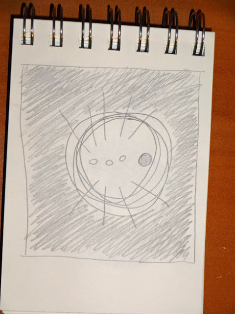
I carried a little sketchbook with me and while we were on a train or bus or something, I did a little sketch of an image that had popped into my head related to the breast cancer. Anna did not know what I was thinking about, but saw the sketch and thought it was cool. She asked me if I was going to make that into an artwork and I said I probably would. She had a completely different impression of the sketch.
I made the piece and was planning to enter it in an exhibition about cancer, which I thought I could do online. I could enter the information online but the images needed to be sent on a CD. Since I found that out the day before the deadline, I decided not to spend the money to overnight a CD and did not enter.
Now, it will be in the Inside View Exhibition.


I decided to submit some artwork for this show. When I first saw the theme, I had an idea to create an artwork with an abstracted view of the interior of a church we visited in Scotland. Well, I never got around to doing that. I had some other things to take care of, like breast cancer.
That leads me to the piece that will be in the show. I got the bad news about a week before we were to leave on our trip to Scotland. While on vacation, I tried not to think about the surgery and radiation I would have to deal with when we returned. But being human, it did cross my mind a few times.
I carried a little sketchbook with me and while we were on a train or bus or something, I did a little sketch of an image that had popped into my head related to the breast cancer. Anna did not know what I was thinking about, but saw the sketch and thought it was cool. She asked me if I was going to make that into an artwork and I said I probably would. She had a completely different impression of the sketch.
I made the piece and was planning to enter it in an exhibition about cancer, which I thought I could do online. I could enter the information online but the images needed to be sent on a CD. Since I found that out the day before the deadline, I decided not to spend the money to overnight a CD and did not enter.
Now, it will be in the Inside View Exhibition.

Hot Spot
hand dyed fabric, painted and stamped
fused appliqué, free motion machine stitching
39 x 34"
©2012 Lisa Flowers Ross
NFS
Well, I think it is a bit obvious and a little different interpretation of an inside view.
The sketch is a bit more abstract and, I think, more impromptu. Also, it is much easier to freely draw those circular shapes on a three inch paper with pencil, than to translate it onto a large fabric piece. So, I think I like the sketch a little better.

Sunday, October 21, 2012
Just a Walk in the Park
Saturday morning. Sunrise. Katherine Albertson Park. Me and my point-and-shoot camera.


 Does anyone know what kind of tree this is? It looks fern-like but feels more spruce.


This last picture is taken with my camera's watercolor mode.

Friday, October 19, 2012
Lines I
I guess it has been a while since I actually posted some finished fabric art. I have one to share with you today. Here is Lines I in it's finished state. It is available for purchase in my Etsy shop.


Lines I
fabrics hand dyed by artist, fused appliqué,
machine stitching
12"h x 11"w
©2012 Lisa Flowers Ross
Wednesday, October 17, 2012
Pockets
Melanie Testa is an author, artist, teacher and more. I often read her blog. Not too long ago, she wrote an online article about the effects of having a double mastectomy and making the decision to be a "flattie" (her word).
The article also talks about how she has to deal with how people perceive her now, as well as how our culture views a woman's body in general. There is a big emphasis on breasts. Here is how Melanie sums it up:
"The article pretty much sums up why I think women are hesitant to put their breast forms aside. I am active in an online forum for breast cancer survivors and the women on this board really would like ‘Flat Awareness’ to occur. We cringe at the thought of Plastic Surgery Reconstruction Day (October 17, search google-!) We don’t want foreign objects in our bodies. We don’t want to wear forms to maintain a ‘socially acceptable body image’. We want to be accepted as women who have decided against reconstruction and we want to push this image into being widely accepted in the societal visual lexicon of what a female body can look like over the course of a lifetime. This isn’t just a choice for women who are ‘of an age’ (i.e. having no stake in the game, and believe me, this is often the response I hear when I say that I decided against reconstruction, it goes like this, ‘Oh! My mother (aunt, grandmother) decided against reconstruction but she was _ _ years old.’). We want to turn the repressive body image pressures off and create a new sexy, strong and beautiful but we are flat or half flat!"
Melanie is working on the "Flat Awareness" part right now. She has started the Breast Pocket project. Someone from her local media said that if she could collect a 1000 pockets, they would try to run a story on it. She is asking people to make a pocket representing someone that has had a mastectomy (one or two breasts) and has decided to remain "flat" or a "uniboober" (Melanie's word).
I'm fortunate that I didn't have to make that decision and Melanie's article reminded me that we always have a choice in our medical decisions. I made two pockets for her. She is the only one I know that has decided to remain flat. Here are the pockets I made (they don't have to be anything specific).
If you want to make some pockets for Melanie, read about it here.

Tuesday, October 16, 2012
BOSCO Part 2
On Sunday, I went to one more open studio on the BOSCO tour. I visited Betty Maguire Hayzlett's studio. She is a member of the Treasure Valley Artists Alliance and I have actually met Betty previously. Kathleen and I have been trying to arrange a studio visit with her and our schedules just haven't worked out. When I saw her name on the list, I figured I would just go this weekend.
Betty's studio is a small space attached to her garage which she shares with her husband who paints. She works with fibers and felting. She had a nice display of some of her pieces in the garage.


Three studios was all that I had the time and energy to visit this weekend. But BOSCO does this event twice a year. So, there is always another opportunity.
Betty's studio is a small space attached to her garage which she shares with her husband who paints. She works with fibers and felting. She had a nice display of some of her pieces in the garage.

This is a floor standing piece.

In Betty's studio, she had this wonderful shelving system full of yarn and fibers. I enjoy seeing how other artists organize their supplies, especially when you can see them all.

Betty also built this special table for her wet felting. It slants down a little so all the water can run down to the corner where she has a little drain installed. I think it is a great idea and makes her work easier.

Three studios was all that I had the time and energy to visit this weekend. But BOSCO does this event twice a year. So, there is always another opportunity.
Monday, October 15, 2012
BOSCO
This past weekend was the Boise Open Studio Collective's studio tour event. Artists in the group open their studios to visitors. I decided to go to a few.
On Saturday, the first studio I went to was Amber Conger's. Her studio is a converted garage. She works with metal and makes large sculptures and some jewelry. One of her sculptures is in the Meridian City Hall building.


The next studio I visited was Lisa Cheney-Jorgensen's. Her studio is also a converted garage with different sections. The part she had open was small, but very well organized. I could have spent all day there looking through her art journals she had out, looking at all the things in the studio and chatting with Lisa.
Lisa creates art journals and books, makes original prints, works with mixed media and is a graphic designer. Her dad made her some great flat files for the space and a printing press. Lisa is so open and sharing with all her work, some of which is very personal.


Talking with Lisa and looking at her drawings inspired me in my thinking that I should be doing more drawing. She draws with a pen. I usually draw with pencil and then go over with pen if I want that effect. Encouraged by Lisa, I decided to go home and try drawing with a pen directly.
Here is a simple drawing of a leaf. I was thinking I would try to draw a leaf a day and also practice my watercolor painting, as I haven't done much of it.
I've posted this on my Facebook Art page and will post any more leaf drawings I do, there. If you would like to see them, you can become a fan of my art page.

Wednesday, October 10, 2012
Distracted
We have a local quilt store that has classes. I haven't taken any in years, but I still get the newsletter and look to see what they are offering. This month they are having a class to make Bridget's Bagettes. They are little zipper pouches with a clear vinyl window.

I thought they would be useful to make and have. So, I was planning to sign up for the class. Then I thought that I didn't need to pay $25 to take the class, I could just buy the pattern and do it on my own.
I went online to see what the pattern cost. Then, I thought that they looked pretty simple and I think I could figure out how to make it on my own. I planned to get some vinyl at Jo-Ann's while I was there for something else.
On my way to drop off Anna somewhere and then continue on to Jo-Ann's, we saw a sign for a yard sale and stopped. I saw a pile of clear vinyl lying on the ground in the form of a hanging shoe bag (with loops, not pockets). The lady said I could have it for 25 cents. O.k. great! Now I had the vinyl.
The pattern above uses fat quarters to make the bags but I thought I would like to make mine with a heavier fabric. While I was at Jo-Ann's I found some home decorator fabric that was on sale and I got some zippers. I was all set.
This week I finally started working on the commission piece I need to complete. But while working on it, my mind was distracted by trying to figure out how to make the little bag. I eventually stopped working on the commission piece and started working on the bags.
My first attempt did not work out well because I saw that the home decorator fabric was a little too heavy to do those nice folded over edges in the picture above. I tried to work with it another way and it was a mess. I un-sewed it.
I decided I needed to figure out a different way to make it with my fabric and went searching for ideas online. I found this tutorial. But I didn't want the zipper on the edge or the vinyl going all the way to the edge and seeing the raw edge on the inside. All I took from that tutorial was making the little tabs at the end of the zipper they way she did it.
Then, I figured I would just make up my own way to do it. The second attempt is actually functional, but a little sloppy because I needed to trim the fabric seams more than I did.

Anna told me she needed a new pencil bag. So, my third attempt is much neater looking and is for her.

The zippers on both of these are 9" long. They are fairly large. But I thought it would be good to hold sewing projects for travel, as I usually just use Ziploc baggies.
I hope to make up a little tutorial sometime and post it here for you. I will also get some smaller zippers and make a different size.
Now that my brain has solved that problem, I can get back to work!
Saturday, October 6, 2012
Books
I had my last radiation treatment this week. Yippee! To celebrate, I bought myself a new yoga mat. (My old one is about 14 years old.) I also ordered some books. One of them arrived yesterday.

This is a used copy, but it is in great shape. Andy Goldsworthy is a British artist who works with the elements of nature, weather and place. He uses what he can find around him when he is out in nature. Many of his works are only preserved in a photograph he takes, as eventually many of the pieces are destroyed. For example, his pieces made from ice that melt when the temperature is too warm.
There is a great video about him that I saw on television or Netflix. I think it is this DVD entitled Rivers and Tides. We could all learn something about patience and nature from this artist.
Another book I ordered is also about an artist that works with nature, although I wasn't consciously thinking about that theme. His name is Patrick Doughtery. This artist created some sculptures at the Boise Art Museum some years ago. Unfortunately, I was out of town when he made them and didn't get to help with the process.
He uses branches he finds from local trees and creates massive sculptural structures, sometimes indoors and sometimes outdoors. They are really great. The book is called Stickwork and I haven't gotten it yet.
I also ordered a couple more books and am just waiting for them all to show up.
Thursday, October 4, 2012
Reduction Linocut - Part II
The butterfly reduction linocut I did in the workshop was only three colors. But my friend, Mary, did a four color print that turned out lovely. Here is the progression.


Since I only did three colors on my butterfly, I had some extra time on the second day. I had also
discovered I had some small pieces of linoleum at home. So when I was finished with the first print, I carved a small design on another linoleum block and printed on my the paper I had leftover from cutting the first pieces down to size. I did a quick two color print and varied some of the colors as I went along.


1st color.

2nd color. This was on a different paper.

3rd color.

4th color. Isn't it great?

Reduction Linocut by Mary Donato
Since I only did three colors on my butterfly, I had some extra time on the second day. I had also
discovered I had some small pieces of linoleum at home. So when I was finished with the first print, I carved a small design on another linoleum block and printed on my the paper I had leftover from cutting the first pieces down to size. I did a quick two color print and varied some of the colors as I went along.


I like how these little flowers turned out. They were quick and fun. What I realize with the reduction method, though, is that if I want to make more of these flowers, I have to carve another block for the first color. Or start a new one because I only have the second color design left.
Wednesday, October 3, 2012
Reduction Linocut
Yesterday, I introduced you to the artwork of our instructor, Mare Blocker, for our Reduction Linocut workshop at Wingtip Press. Now, I will show you what I made.
I had a hard time trying to decide on a design. I wanted to do something abstract, like I usually do in my other artwork. But I couldn't figure out how to do what I wanted. Since this was my first time attempting a reduction linocut, I also didn't want it to be too complicated. I gave up on the two ideas I was contemplating. Eventually, I pulled out my butterfly book, picked one and drew it.
I transferred the drawing to the linoleum block and started carving. The first color I printed was yellow. You can see my first color (at the bottom of the picture) along with some others on the drying rack.

After you print as many copies of the first color as you would like, then you carve out more on the same block. My second color was orange and I knew that I didn't need to ink the whole block because there was only a small section of orange on the butterfly.
You print right over the first layer of color and have to be careful with registration of the paper so you can (hopefully) get things to line up. Here is one of the prints with the orange on it.

After you do all the prints with the second color, then you go back to the block and carve out more for the next color. I only did three colors and black was the last.
Below are two of the final prints. The bottom one has black ink as the last color. My friend, Mary, suggested I try blue as the last color. So I did a few with blue (the top one has blue ink).

Since I did not roll the orange all the way over the yellow, when I added the blue, it made the top part of the wing look more greenish and the bottom part of the wing look more brownish because the inks aren't totally opaque (yellow+blue=green, orange+blue=brown). Here's a closer look. Which one do you like better?

You can also see that I'm a pretty messy printer with some of the ink getting on the rest of the block and printing. I don't mind because I can cut these out if I want to use them for anything.
I only did three colors, but some people did four. I'm sure you could do more than that as well. I'll show you some more tomorrow.
Tuesday, October 2, 2012
Printmaking Workshop
This past weekend I took another printmaking workshop at Wingtip Press. Reduction linocut was taught by Mare Blocker. Reduction linocut also has the nickname of "suicide" printing. This is because all the printing is done from one block. You cut more and more away on the same block with each color. If you mess up, you can't go back and change it.
Mare Blocker was our instructor. She lives in Donnelly, Idaho and is a printmaker/book artist. She was a very fun teacher with lots of information. She also brought many of her own pieces to show as examples. Here are just a few.

 This piece above is actually a book. It is laid out flat, but can be folded back up into a book. It then looks something like the picture below.


Tomorrow I'll post what I did in the workshop, which doesn't come near the quality of these.
Mare Blocker was our instructor. She lives in Donnelly, Idaho and is a printmaker/book artist. She was a very fun teacher with lots of information. She also brought many of her own pieces to show as examples. Here are just a few.

These are all different types of printmaking by Mare Blocker, not just reduction linoleum printing.


Here is a close-up of the hand stitching on the paper that Mare did for this piece.

Below is a set of prints that Mare did to celebrate the 16th anniversary of having her press. These are reduction linoleum cut prints in two colors. I think the set is really nice and is a good example of what can be done with just two colors.

This example is the cover of a book with different printing techniques along with hand stitching. I really like the colors of this piece, the stitching and the energy that the swirls create.

Tomorrow I'll post what I did in the workshop, which doesn't come near the quality of these.
Subscribe to:
Posts (Atom)