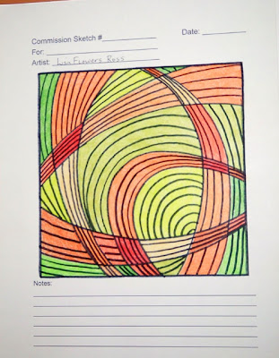
After many obsessive hours and small thumbnail sketches, I narrowed it down to four to show the patron.
To make a nice presentation, I created a generic sketch form on my computer. At the top of the page was a space for the patron's name, a space for my name, a space for the sketch number and the date. Then I created a square box that the sketch would be drawn in and on the bottom of the page I had blank line for notes. I printed out several copies and drew the final designs on these. One design for each page.
I used colored pencils to fill them in with the palette choice (which I drew from the inspiration photo). Since I wanted to show how the quilting lines would be but didn't want to draw them directly on the colored design, I traced the box and design on a transparency sheet in permanent marker and drew the quilting lines on that, again with permanent marker. Now, they were all black which was not the color I was going to use for them, but it was just to get the idea across. Since the transparency was a separate piece, it could be removed to see the design better.
Then I also created a fabric swatch palette because the fabric colors don't exactly match the colored pencils. I cut a little rectangle of each from different fabrics and stapled them to a piece of card stock. I didn't put a swatch from every fabric I have, but the ones I thought would work. There were enough fabrics for the patron to have a good selection.
The two fabrics that are turned sideways are the only commercial fabrics. The rest are my hand dyed fabrics and I explained to the patron at the first meeting that I dye most all my fabric in the summer so I probably wouldn't be dyeing any extra now (although if absolutely necessary, I would dye more if needed).
I think this seemed like a fairly professional presentation of ideas.
Next installment: the commission agreement.


No comments:
Post a Comment