Pages

Wednesday, March 6, 2013

Hemingway & Women

While I was at BSU for the Opening Doors exhibition,  I also got to see the Hemingway & Women exhibition which is on display in the Special Events Center.  This exhibition was put together by my friend Amy Nack and is a portfolio of prints that explores the relationship of Ernest Hemingway with women. Twelve Boise artists each created a print based on this theme.

Disclaimer:  All these photos are not great.  The artworks are framed with glass and there is a wall of windows and glass doors opposite the artwork.  This should be inspiration for those in town to go view them in person.


 Hemingway and Women, drypoint by Judith Lombardi

This artwork above is probably my favorite of the exhibition.  I love the expressions on the faces.

I did not realize until I grouped these photos together here below, that they all use a similar color scheme in their print.  They are not displayed side by side at the venue, but obviously the colors help make it a more cohesive group.

 Love's Dark Sister Fills in All the Forms, drypoint on monotype by Odessa Leedy

 Characters in Search of a Role, mixed print media with chine collĂ© by Maria Carman Gambliel 

An Onion, three color relief by William Lewis

The exhibition will be up through July 12th.

Monday, March 4, 2013

Opening Doors

Last week I was able to get over to BSU for the opening of BOSCO's (Boise Open Studio Collective Organization) opening art reception.  The exhibition, Opening Doors: A Glimpse into the Artist's Mind, is on display in the student union gallery.


What one might notice when first entering the space is how colorful and energetic many of the works are.


On the left: Radiant by Barbara Michener.  On the right: Landscape of the Heart by Betty Hayzlett.

Self Portrait by Kelly Beach

This unconventional self portrait above makes great use of complementary colors to move the eye around and create an intriguing sense of atmosphere.

There were a few artworks that were more subtle in color.  

 Blue Car by Karen Bubb

There is no blue in the artwork below, that is a reflection.  Those of you in town will have to go see this one in person as I'm afraid the photo does not do it justice.

And God Said by Sue Latta

Old Oak Jar by Jerry Hendershot

There is a variety of media and styles represented in the artworks.  The exhibition will be up through March 25.


Saturday, March 2, 2013

Daily Project Review

I put together a little composite of all the daily fabric compositions (plus one).  It took much longer than I intended as I was having issues of Photoshop getting stuck on one tool.  (Anybody else have this happen?  I've read on the internet that others have, but none of their tricks seem to work except for restarting the computer.)

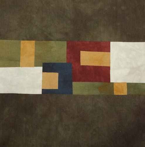
Here they are all together in order with the extra one at the end.  Do you notice any patterns?


My thoughts:

-  I thought they would be more cohesive as a group since I started out with a limited number of fused fabrics.  But later I started adding some more fused fabrics that were leftover from some other projects.  That made it more varied.

-  I thought some progression of pattern might occur, but it never really did.  Every morning was just looking at the pile of fabrics and see what I come up with that day.  Maybe if I had done three or four in a day, the thought pattern would be more progressive.  But since I did one and then waited a day, it wasn't a continuous idea.  Except for when I created a little motif on day 20 (that looks like a door, house or gate).  Then I worked with that motif for several days in a row and even came up with an extra one.

-  For the most part, I started working on the piece as a whole, picking some fabrics to start with and then building on that.  Working with the motif was a slight shift in the thinking process, sometimes, as I started building the motifs and then figured out how to put them together to work.  Other times, the motifs were envisioned as a whole piece from the beginning.

-  There are no curved lines in any of these (except for the screen printed stitching on fabric I used in a couple of pieces).  I did cut all the straight lines without a ruler, so they are somewhat organic.  I thought about trying a curve, but my natural inclination was to just play with straight lines and shapes.

-  There are no diagonal lines or shapes.  I did try turning sections on the diagonal a few times while I was working, but it seemed too dynamic or unstable for such a small piece, and for my preference.  I often like to seek the balance and "stability" in an artwork.

- Obviously, some pieces turned out better than others.  That happens.  Not everything can be a masterpiece and these were just exercises.  I will finish some of them with machine and/or hand stitching, but I probably won't finish them all.

-  I had no preconceived notions of subject matter before starting the project.  It was a way to "play" with what was in front of me.

-  It helped to have the fabrics all fused and batting all cut before beginning the project.  I also had a sheet for fusing on that had the finished dimensions drawn on it as well as some outside dimensions.  I also employed mat board as a viewfinder while working since I knew they would be cropped down to a certain size when finished.

-  As I was working at the museum a lot (for me) during the month of February, this was a great way for me to work on a little art each day.  I think it really kept me from getting cranky.  I realize I do get cranky when I can't do anything creative for a while.

-  I noticed I had a really hard time working with the white fabric that had the screen printing on it.  I think maybe the white was just too much contrast or too bright for me.  That might be something to challenge myself with sometime, as I rarely use white in my larger pieces as well.

-  I particularly like the color combinations in #8 and #26.  I liked using a little bit of the intense "jewel" colors (like deep fuchsia) as an accent, but too much "jewel" colors together (as in #23) is too much for my tastes.  I realize some people really like that.

-  Some nice coordinated groupings can be made with these pieces, but they won't be in numerical order.  It will be mix and match.

I think I could do this again during a different month with some different parameters.  But for now, I have to work on getting some of these finished.

Feel free to tell me which numbers are your favorites.

Friday, March 1, 2013

Daily Fabric Composition

I did it.  I completed a fabric composition for each day of the month of February, plus one bonus one.  I will get you caught up with the last week.

Daily fabric composition #28

Daily fabric composition #27

Daily fabric composition #26

Daily fabric composition #25

Daily fabric composition #24

Daily fabric composition #23

Daily fabric composition #22

Tomorrow I will review some of my thoughts on the daily project.

Thursday, February 28, 2013

Reduction Linocut

Last night I went to Wingtip Press and printed the first color of my reduction linocut attempt.  It went pretty well.   So now I'm really scared for when I go back in a couple of weeks to do the second part of the "suicide" print.  That's a nickname for reduction linocut because if you mess up, you can't go back and print more. You are always cutting away on the same plate.

I have carved out the material for the second color and hope I made enough of the first color prints that I will have enough good ones on the second color run.  I think this one will be tricky to register as I don't really have any wiggle room on lining up the second color.

Here's what it looks like at this point.


Wednesday, February 27, 2013

Public Art

Last night was another session of the Public Art Academy workshop I am taking.  We had guest artists come in and talk about their experiences doing public art and how they jumped into it.  And we got to see the actual proposals for some public art.

 My bookclub buddy and mosaic artist extraordinaire, Reham Aarti, was one of the guest artists to speak.

Above is the proposal for the installation at Idaho Ice World.  Below is the proposal for the mural that was at 8th and Main for some time. I believe both of these were by Byron Folwell.


 Several different proposals for different projects.

Above is the proposal for a kinetic sculpture that will be built in Julia Davis Park.  Below is Mark Baltes, who has completed several public art pieces around town.  He discussed some of his projects and how he came up with the ideas and how he works on a proposal.


I have been enjoying this workshop and learning a lot.

Tuesday, February 26, 2013

Linocut

I am switching gears this week.  The exhibition is up at the art museum, so I am back to my regular routine.  But instead of working on the large in-progress fabric piece, I am working on a linocut for a print exchange.

Below is just the start.  I'm attempting a reduction linocut.  Right now it kind of looks like duck feet, but that is not what it is.  I'll post a picture when it is completed (if it turns out).


Thursday, February 21, 2013

Daily Fabric Compositions

I cannot believe that three weeks of February have already passed by.  I've been enjoying creating my daily fabric compositions in the morning before heading off to work at the art museum.  It's time to get you caught up.

These will all eventually be squared up when finished.

 Daily fabric composition #21

  Daily fabric composition #20

  Daily fabric composition #19

  Daily fabric composition #18

  Daily fabric composition #17

  Daily fabric composition #16

 Daily fabric composition #15

Wednesday, February 20, 2013

Sesqui Shop

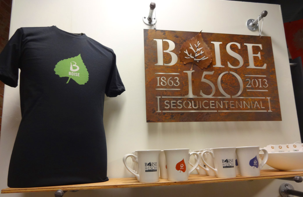
I don't think I had ever heard the word "sesquicentennial" until this year.  Because it is Boise's. The city has opened a shop for the year to hold events , sell stuff and have small exhibitions. They also have information about celebration activities throughout the year.

I have been there several times as I am taking an eight week workshop hosted by the city's Arts & History department about Public Art.  We meet at the Sesqui shop once a week.

If you are in town, you should check out this month's exhibition of some of Pat Kilby's paintings.  I didn't have time to get any pictures of his work.  Check the link on his name to see some of his work or go check it out in person.  I think it is only up through the end of the month.

He also created three Boise prints that are for sale in the shop.


These are some great collagraph prints of buildings in Boise.  They were created in Wingtip Press' workshops to honor Boise's 150 years.  Throughout the year, Wingtip will host FREE workshops to create a collagraph print.  Anyone can sign up, but you do need to sign up as space is limited. You can see a schedule of the workshops here.

Monday, February 18, 2013

Imperfection Achieved

Before Christmas, I started working on a large piece that was to consist of four panels.  I didn't get very far because I had to switch gears in January to meet a deadline.

I met the deadline and now my attention is back on the large piece.  Here you can see the start on my design wall.


My idea was to fill in all that background with extreme machine stitching, covering closely every inch.

So I started with the only panel that had a full circle (that third one).  I sandwiched it with batting and have spent hours stitching the bleep out of that background.  

Doing big sweeping circular motions using free motion stitching is quite difficult.  Here's a section.  There are about four or five different thread colors in this.


The stitches are not consistent and the lines are wobbly.  But what I'm going for is the texture.

I've been working at the art museum quite a bit lately.  We are installing an exhibition that includes some Native American bead work.  In the work, the artist would purposely put a bead out of place (i.e. a white bead in a blue sky) so that it was not perfect, because humans cannot be perfect.

Well on this piece, I don't purposely have to create any imperfections because they are already there.  I noticed an even bigger one after I finished stitching the entire first panel.   Doing big circular stitching in different directions made the fabric very distorted.

I steamed and ironed and pulled and stretched.  Although it is now flatter than it was to begin with,  I still cannot get the circle to lay flat.

Looks o.k. from the front . . .

but not from the side.  See the nice bulge?

I can press in the center and make a crater instead.

I have learned a few things from this, I think.  I probably need to use a heavy stabilizer on the back of the fabric before quilting.  Or maybe I just use canvas behind it with no batting.  Now I know how to make a hill if I ever need one (although if I actually try to make another bulge, it would probably turn out flat!).  It also gave me an idea to try for a different way to construct a piece.

What to do?  Hmm, I don't think I can salvage this panel for this particular piece.  I will probably have to make a new panel to replace it.  But I am thinking about cutting this panel up and see if I can make it work as something else.

It is definitely disappointing as I've put a lot of time into this and I am now back to square one.  But hopefully, I can now figure out how to fix it so it won't happen again. We'll see.


Sunday, February 17, 2013

Generosity

I work with two guys at the art museum that are also artists.   (I posted about an exhibition they were in last year at the Enso space.)  On Friday, Todd gave me one of his artworks to thank me for all the work I have been doing at the museum.

I was very surprised and honored to receive such a gift.  Here is the piece. It was very generous of him to give me some of his artwork.

(Photo posted with permission of artist.)
Untitled
by Todd Newman
acrylic on board
approx. 10" x 6-1/2"