

Saturday, June 30, 2012
Thursday, June 28, 2012
Leftovers III
Today we move back out into nature. I really love this first print by my friend and local artist, Mary Donato. It is titled, Haws. And she told me it is a screen print with three colors.


Tuesday, June 26, 2012
Leftovers III
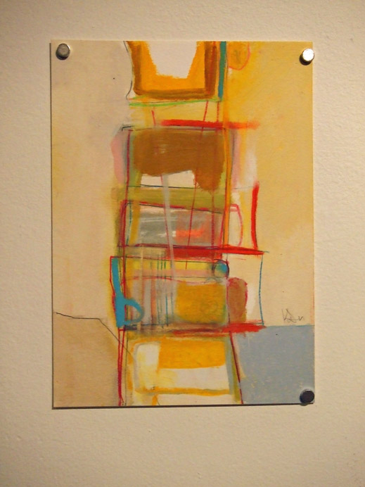
Welcome to another structure-inspired print. The simplicity and geometric shapes of this one is just really lovely to me. The Red Mat just makes the whole piece. The artist is Adell Shetterly.


Monday, June 25, 2012
Leftovers III
I have just a couple of structural items for your viewing pleasure. The first is Interior, a print from my friend and local artist Cassandra Schiffler.


Saturday, June 23, 2012
Leftovers III
Last, but not least in the animal oeuvre is our favorite, the cat. This cat caught my attention with it's expression and I thought Anna would like it. The print is titled, Sour Puss, by ?. I'm not even going to guess the signature.


Friday, June 22, 2012
Leftovers III
The animal du jour looks to be some kind of deer. This print is titled, if ever it were so . . ., by Jessica Wuglt (?). I'm sure that last name isn't right but I can't decipher the signature.


Wednesday, June 20, 2012
Leftovers III
Moving away from the bird realm, but still in the animal realm, I present a print with hares titled, #1 by Kyoko. I do not know where this artist is from. Hopefully, Amy will eventually get all the prints on the Wingtip Press blog and I will be able to find out.


Leftovers III
I have one more bird print flying around here. This one is also by a local, Judith Lombardi. It is titled, Magpie and Cherries. It looks like a linocut.
It's interesting that I chose these more realistic birds (although I like all kinds of art). But they are still minimal in their subject and color.

It's interesting that I chose these more realistic birds (although I like all kinds of art). But they are still minimal in their subject and color.

Tuesday, June 19, 2012
Leftovers III
Today is another print of a bird by local artist Lisa Cheney-Jorgensen called, Forgotten Carols. It is not black and white, but just one color. The scanned color is a little off from the print. It is not this dark and is more red.


Sunday, June 17, 2012
Leftovers III Prints
Awhile ago, I helped Amy Nack of Wingtip Press get the prints from Leftovers III ready to mail. The advantage to doing this is that you get to pick the prints that you receive from participating. Fun, but not an easy task to pick only twelve from around 150 choices.
Over the next week or two, I will be sharing my choices. The major theme apparent in my choices is that I tend to like black and white prints (same with last year). So, let's start out with animals.
Unless it was written on the print, or I was told by somebody, I don't always know what kind of print they are. I also have a hard time reading signatures sometimes, too.
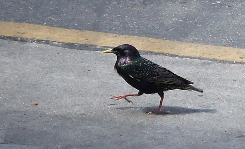
First up is Corvus on a Wire by Diane Hepkins (?). Looks like it could be a linocut. There is a mini-theme of birds in the prints that I chose.

Over the next week or two, I will be sharing my choices. The major theme apparent in my choices is that I tend to like black and white prints (same with last year). So, let's start out with animals.
Unless it was written on the print, or I was told by somebody, I don't always know what kind of print they are. I also have a hard time reading signatures sometimes, too.
First up is Corvus on a Wire by Diane Hepkins (?). Looks like it could be a linocut. There is a mini-theme of birds in the prints that I chose.

Saturday, June 16, 2012
Reflect
I created this artwork several months ago. It is an anomaly in my current stream of work, but it wanted to be made. I am curious to find out what it makes you think of when you look at it. So, please feel free to leave a comment.


Reflect
hand dyed and commercial fabrics,
machine pieced, machine appliqué,
free-motion and machine stitching
33 x 19-1/2"
©2012 Lisa Flowers Ross
(Available for purchase.)
Saturday, June 9, 2012
Art-full Week
This was an art filled week. Unfortunately, it wasn't me working much on my own art, but more so being inspired by other's artwork.
In addition to viewing some art on First Thursday, yesterday my friend and I went the opening reception of Kelly Packer's exhibition at the Enso Artspace. Enso is a relatively new art collective (just about a year old) in Garden City. I've been meaning to visit the space. They are only open one day a week, as well as for receptions and events. So this was my first visit.
Located off the beaten path of Chinden Blvd., you enter through an unassuming door into a warehouse/storage-like space. Once inside, it is apparent that it has been transformed into a gallery space. The space is very nice, although the concrete floors and heightened ceiling made it a little noisy with many people talking and reminded you of the building's original intent.

Packer's work was in the main area downstairs. There was a small, loft-like area upstairs which had some pieces of other members in the collective.


Interspersed and artfully placed on the walls was text written by Packer's husband, Adrian Kien. He had written poems inspired by her work and they created a limited edition book with both that was available for sale. The book looked very well done and of a nice quality.
I think the idea of writing a poem based on an artwork would be an interesting exercise. I've done the opposite and been inspired to create artwork based on a poem. My piece Two Roads Diverged in a Yellow Wood was inspired by Robert Frost's poem, The Road Less Traveled.


 Kathleen Probst views here we have the meatuses of deer standing still by Kelly Packer, acrylic on matboard, 2011
Other artworks were a little darker with more contrasting colors and more complexity.
 The Least Space Inhibited by Kelly Packer, oil pastel on matboard/wood panel, 2012
In addition to viewing some art on First Thursday, yesterday my friend and I went the opening reception of Kelly Packer's exhibition at the Enso Artspace. Enso is a relatively new art collective (just about a year old) in Garden City. I've been meaning to visit the space. They are only open one day a week, as well as for receptions and events. So this was my first visit.
Located off the beaten path of Chinden Blvd., you enter through an unassuming door into a warehouse/storage-like space. Once inside, it is apparent that it has been transformed into a gallery space. The space is very nice, although the concrete floors and heightened ceiling made it a little noisy with many people talking and reminded you of the building's original intent.

Packer's work was in the main area downstairs. There was a small, loft-like area upstairs which had some pieces of other members in the collective.


Interspersed and artfully placed on the walls was text written by Packer's husband, Adrian Kien. He had written poems inspired by her work and they created a limited edition book with both that was available for sale. The book looked very well done and of a nice quality.

Below are some of the words I liked most.

Quite a few of Packer's works used warm, analogous colors and geometric shapes that appealed to me. It was sunny on the surface, but further inspection revealed a slight edge with sharp lines and the underlying reference to vertebrae in the spine.


Other artworks were a little darker with more contrasting colors and more complexity.

Overall, I enjoyed Packer's strong use of color and shapes. If you would like to see more of the artwork in the exhibition and much higher quality images, please visit here.
Friday, June 8, 2012
Around Town - First Thursday
Last month I mentioned that my friend Cassandra Schiffler was going to have some interactive painted blocks at her First Thursday reception this month. She was the featured artist in the 8th St. Northrup Suite 295 AiR space.
Below is a picture of the set-up of blocks. People could come in and rearrange the blocks in any order they wanted, then a person took a picture of the arrangement, printed out a photo with a mini printer right there and pinned it to a board with all the other arrangements. (I wanted to take a picture of the board, but forgot).
 You could come back at the end of the evening to pick up your picture. I just took my own picture of the arrangement I made. However, a few pictures got lost in translation from my camera to my computer, so I do not have it.
Cassandra had lots of her work displayed and the entire space looked very professional. These pictures below were in her work area space.


I also stopped in the Lisk gallery to see some kinetic sculpture by Matt Grover. The wooden balls on this table moved in a wave pattern. It could be very meditative to watch it.


Below is a picture of the set-up of blocks. People could come in and rearrange the blocks in any order they wanted, then a person took a picture of the arrangement, printed out a photo with a mini printer right there and pinned it to a board with all the other arrangements. (I wanted to take a picture of the board, but forgot).

It was a great idea for people to interact with the art, with the added bonus of touching the artwork. I think Cassandra should sell sets of blocks. Then people could arrange them the way they wanted in their own home. If they wanted a little variation, they could change them up over time. It would also be fun for visitors.
Cassandra had lots of her work displayed and the entire space looked very professional. These pictures below were in her work area space.


This is one layer of mechanisms to help move the balls up and down.

Other things around town.


Thursday, June 7, 2012
Take a Hike
In our continuing effort to break in our new hiking shoes, Anna and I went for a "hike" yesterday. We decided to walk down to Boise High, where Anna will be attending next year, to see how long it would take from our house. It took about 40 minutes at a pretty good pace.


Of course, the Co-op was conveniently located on our way back and we had to stop for a snack. Anna found a new drink that she really liked. I got a quick taste, but apparently, sharing was not an option!


I took the picture below because I really liked how the grasses created that white line along the slope of the hill from where I was standing.

Monday, June 4, 2012
Japanese Woodblock Printing
This weekend I spent all day Saturday and Sunday taking a Mokuhanga Japanese Woodblock Printing workshop hosted by Wingtip Press. The workshop was taught by Shannon Milar from Berkeley, CA.
I have never done any woodblock printing and have always loved Japanese woodblock prints. So I was very excited for this workshop. We worked on a four color print.
This picture is an example of the four blocks and corresponding print.

First you draw your image and transfer it to a woodblock. The first block is called the key block. It is like the "outline" and guide to creating the other blocks. Below is my carved key block and a proof print.

Ritta carving her block.

After you have your key block, you carve a block for each of the other colors you plan to use. Here, the instructor, Shannon, is showing us how to print the second color.

Below is an example of one of Shannon's finished prints.

In this picture, I have started to print my second color. The first color was the yellow ochre on the plexi to the right. The second color is the green you see on the brayer. My blocks are laid out in order on the edge of the table.

My friend, Mary, printing her block.

This is what my print looked like with three colors before doing the final key block.

Here is my final print. I only got this one completed. I have to finish printing the black on the rest of them.

Below are most of the students' prints. The one in the upper right corner is not completed, but it is going to look really cool when it is. The coffee pot one is Shannon's example she worked on to show us what to do.

Friday, June 1, 2012
SAQA Auction Piece
Today is the deadline for sending in an artwork for the Studio Art Quilt Associates benefit auction. I sent in my donation piece awhile ago. Here is it. Some of you might have seen it on Facebook already.


Starry Forest
fabrics hand dyed by artist,
fused appliqué, hand stitching,
machine stitching
©2012 Lisa Flowers Ross
You can bid on this piece or many others in September. Preview the artwork here on the SAQA site and get the dates and instructions as well. There are several pages of artworks, so make sure you visit them all. There might be some last minute ones they still have to put on the site.
Subscribe to:
Posts (Atom)